‘Tugboat’ drawing, pencil, pen on paper. Howard Small.
‘The Ghost of Cape Scott’. Pencil on paper. Howard Small.

‘Crab fishing’ - pencil and pen on paper drawing. 1983. Howard Small.

‘Tugboat’ drawing, pencil, pen on paper. Howard Small.

‘The Ghost of Cape Scott’. Pencil on paper. Howard Small.

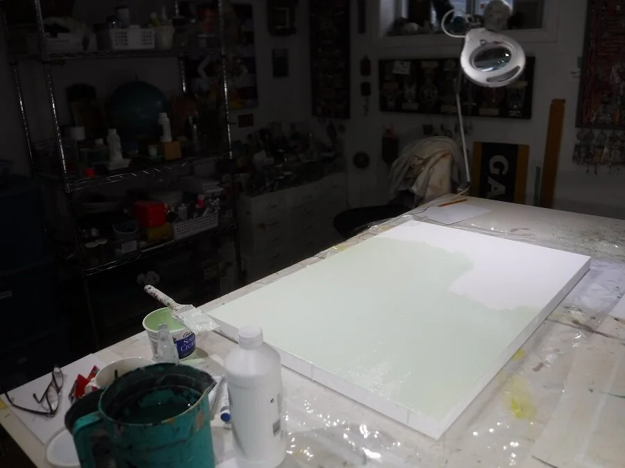
I’m stretching my own canvas for the next painting. I ran out of the regular weight canvas, so I’m trying this, which is a heavier weight. I cut the canvas 2” bigger than the frame and wrap it around and staple it with an electric staple gun.

I primed the canvas with some crimson paint mixed in to colour it. I just like it. I haven’t decided what I’m going to paint yet. It’s either going to be an amaryllis, or an old family photograph. I’ll see which one looks better on the canvas.

The beginning of the ‘amaryllis’ painting.

A close-up of the leaf and stem. I just wanted to see what it was going to look like. None of the pink background will remain when it’s finished. I just like painting on top of a colour. I put a layer of matte medium on top of the tinted gesso background to make it smoother to paint on.

I was up late working on the painting. I’m just trying to paint the first layer so I know which colours go where. I’ll do another layer and add more detail after this is done. It looks pretty good so far though, I have to say.

The fist layer of paint is almost finished on the flower. I had to stop and go to bed.

I’ve got the first layer of paint onto the canvas. I’m working on the central part now. Lots of subtle changes to be made yet. This is the beginning of the next step, which is to blend the colours from light to dark a bit better. The lights need to be lighter, and the dark parts darker.

I painted the blue background on the painting. I did a couple of white-to-blue graduated stripes, but they were too distracting, so I painted over them.

I’m working on the right-hand side of the painting, and the middle. I’ll do the petals on the left side next. It’s comin’ along.
This is the over-painted photograph I did for the cover of the next book, called ‘the fat lady sings’. This was taken in Value Village by my friend Kate. It’s for the poem of the same name.
I’ve done some paintings and I have lots of poems for the book, I just need to start.

The front of the double-layered ‘goldilocks’ painting. Me in the kitchen of the house in Oshawa, with three bowls of porridge, and a panda bear looking in through the window.

The back of the ‘goldilocks’ painting. Me outside the house looking in at a wok on fire, from an actual event. The painting was done in 2003.
Tinted gesso on the canvas, layer one of three.
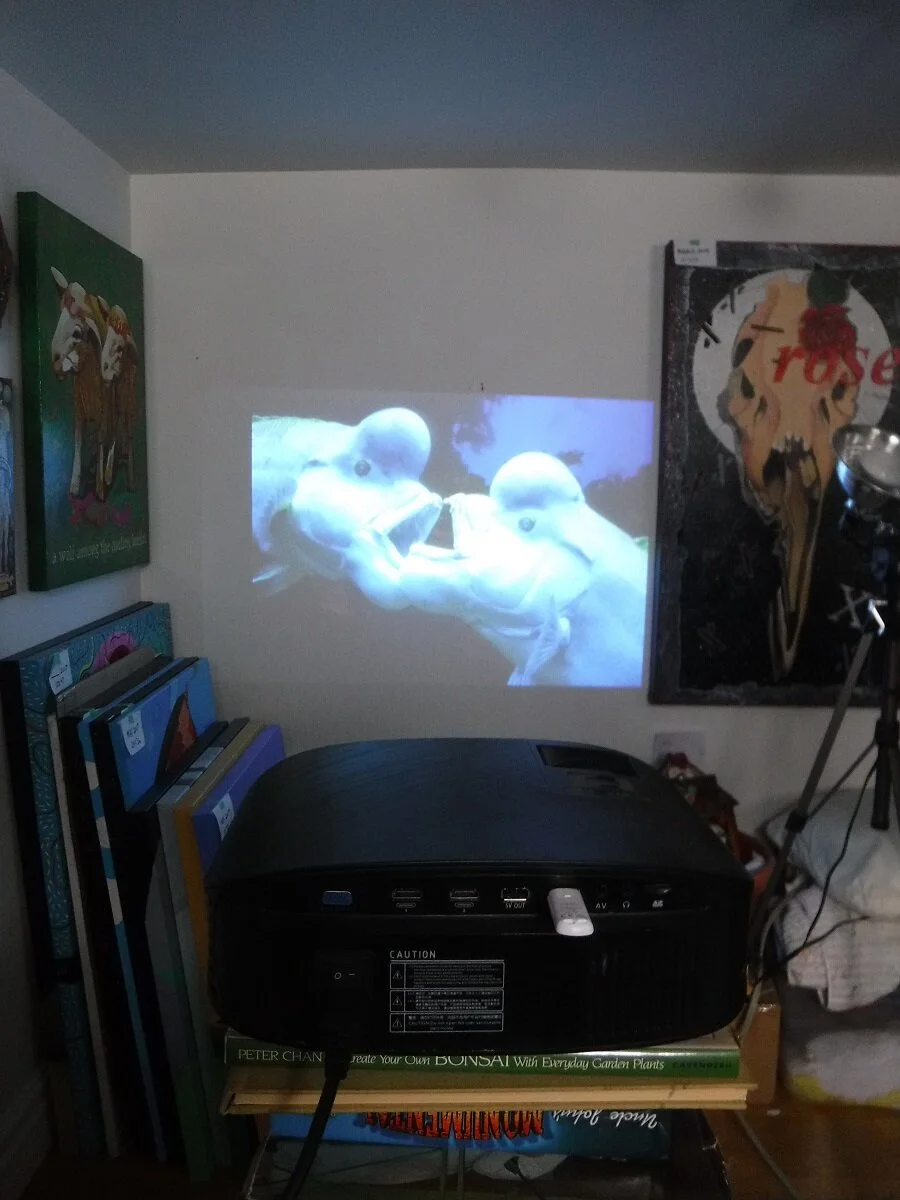
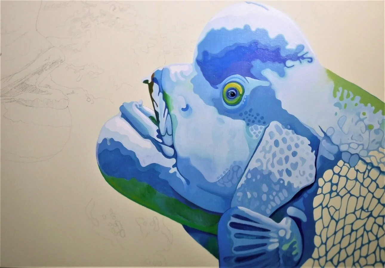
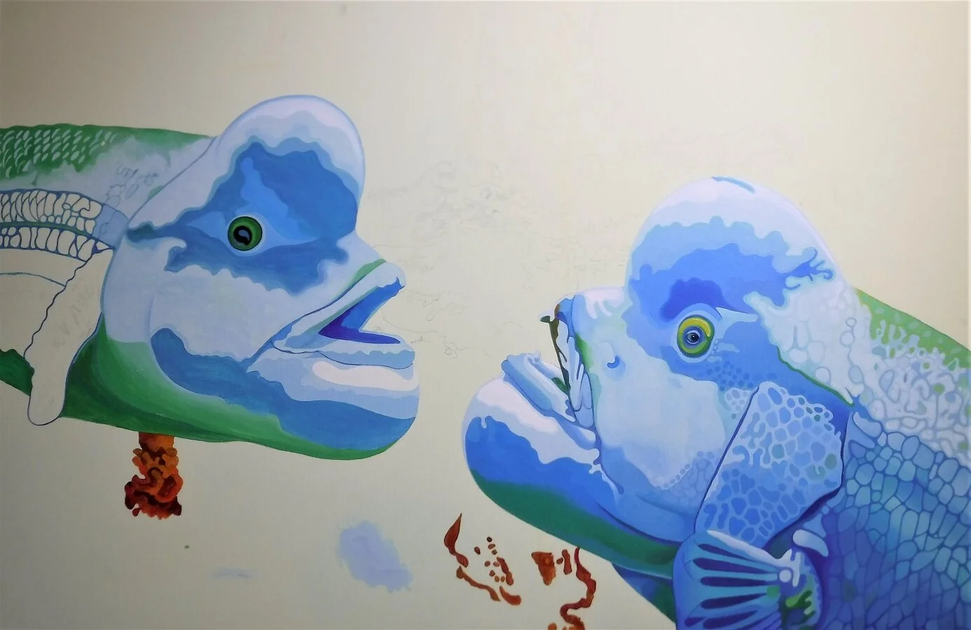
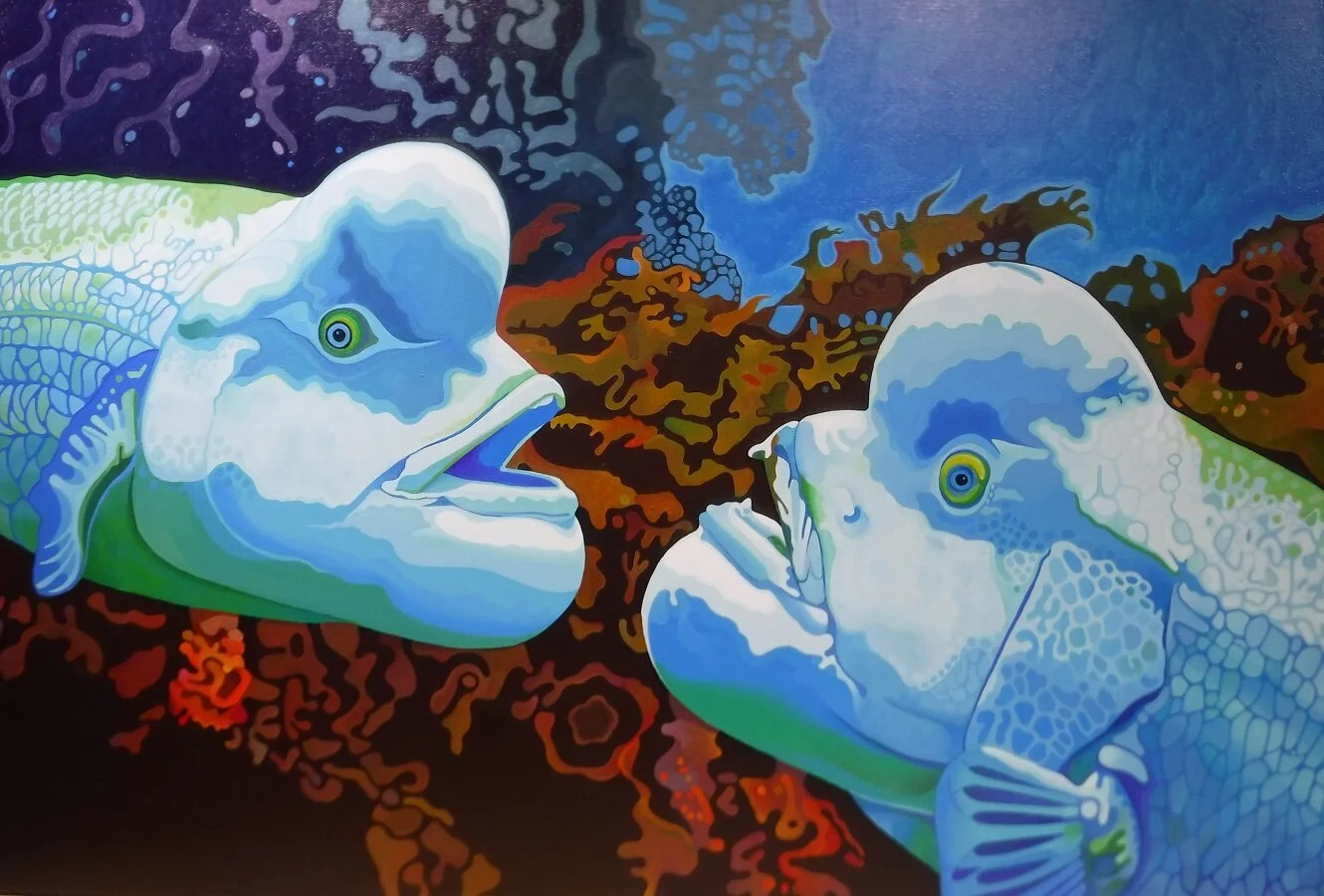
The projector, projecting the image onto to the wall to see what it’s going to look like. This isn’t my photograph, of course. It’s from a Blue Planet program. The photographer is Tony Wu.

The drawing on the canvas, with one layer of paint on the fish.

The original photograph. I got this online.
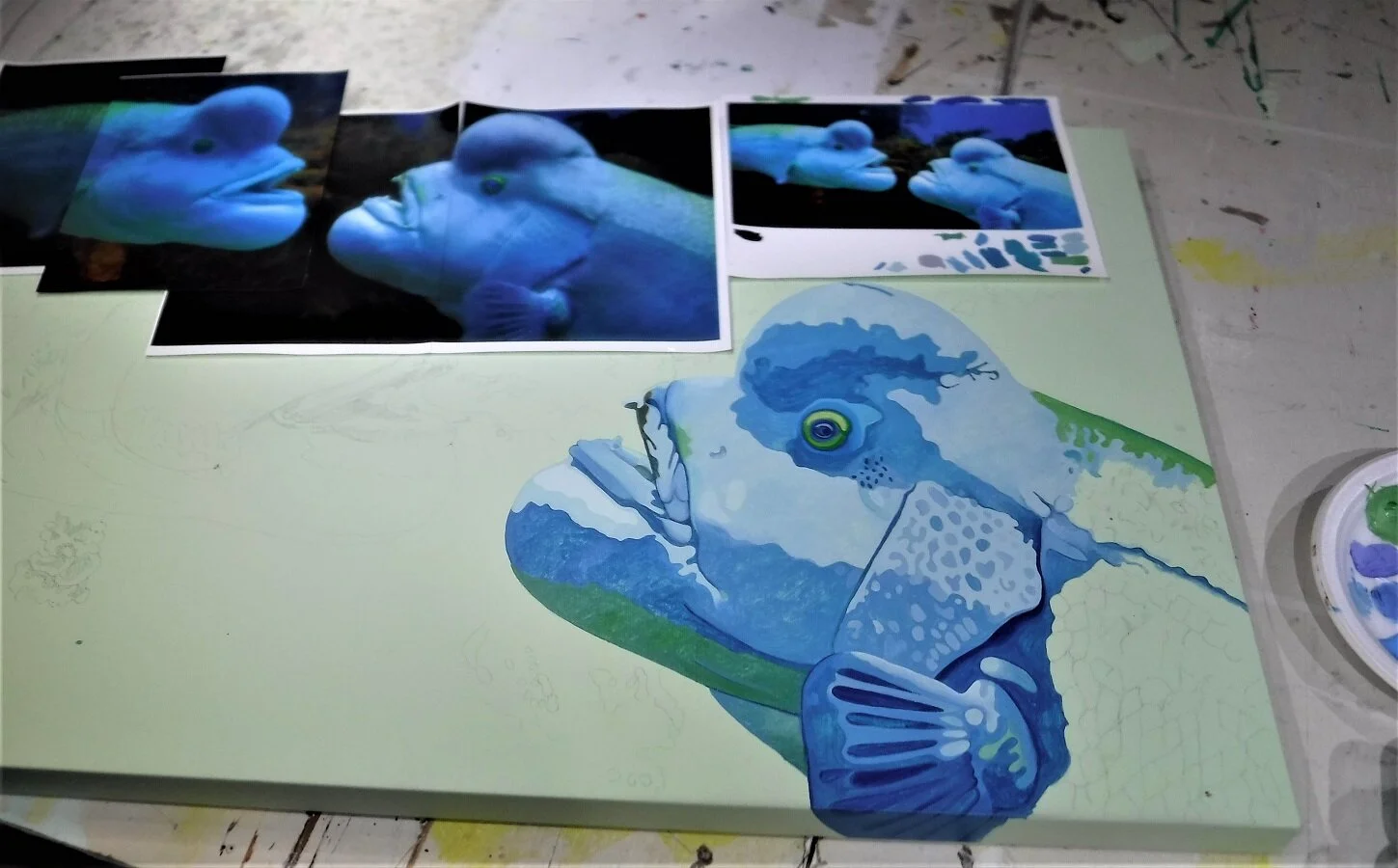
A look at the painting and the photographs I printed as reference. The fish is called a Sheepshead Wrasse, or Kobudai in Japanese.
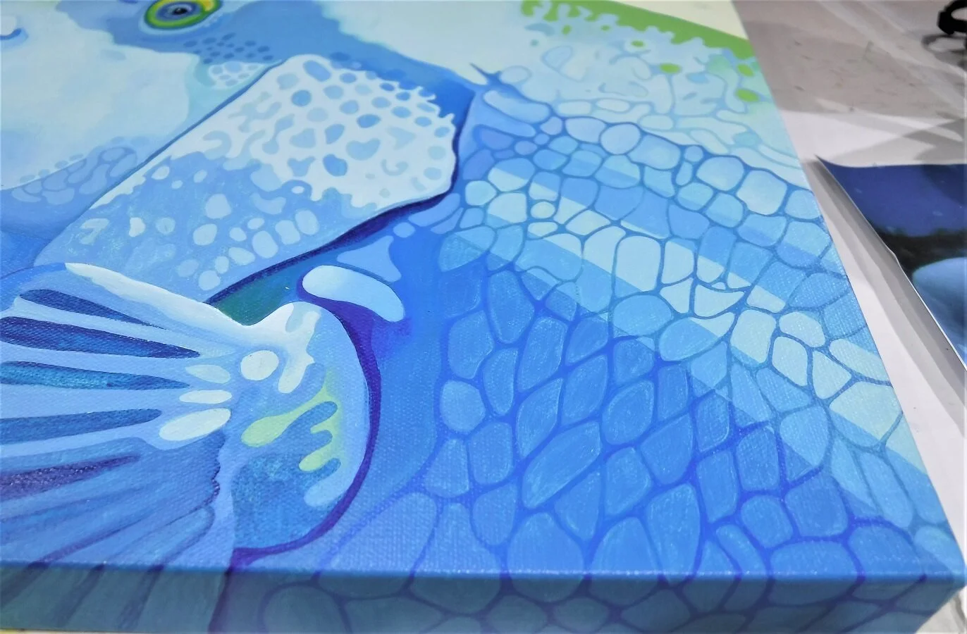
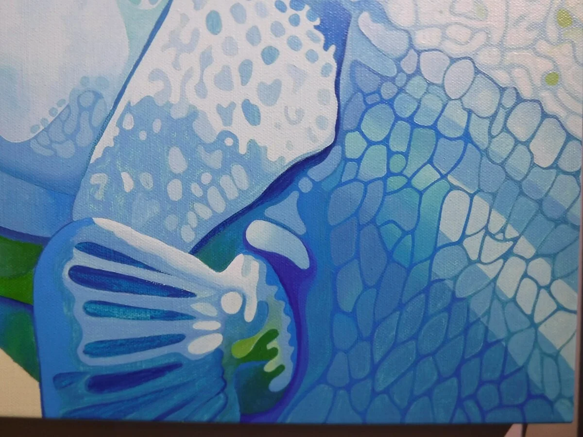
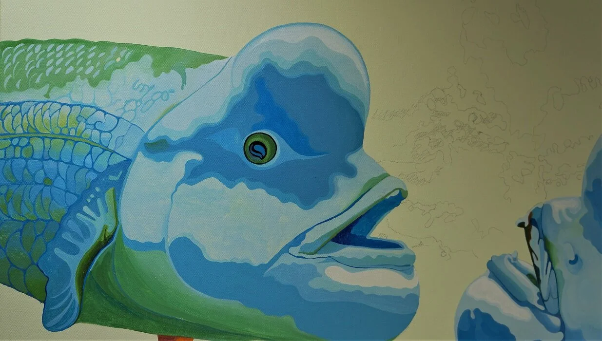
More work done on the ‘bumpfish’ painting. I started the scales on the right hand side.
I painted the first layer on the scales. I wanted lighter and darker stripes running down the side.
Now I’m blending the colours to make the stripes less distinct.
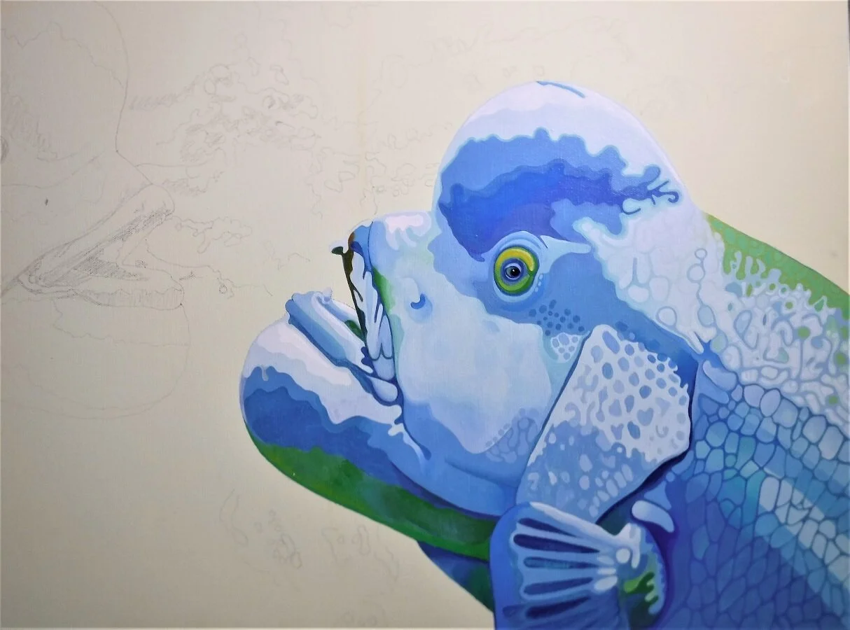
The whole fish, with the scales and the lighter areas painted on the top of the fish.

I started the fish on the left hand side. I also did some of the seaweed in the background, just to paint something in a different colour.
Layer one of the paint on the scales on the left-hand side. The fin wasn’t as hard to do as I thought it was going to be. There wasn’t much definition in the original photograph.
Layer 2 of 3 on the fish on the left.
The scales on the left hand side are finished. I also added some more green and blue paint to the bottom of the fish.
O.k. so I missed a few in-between steps here…
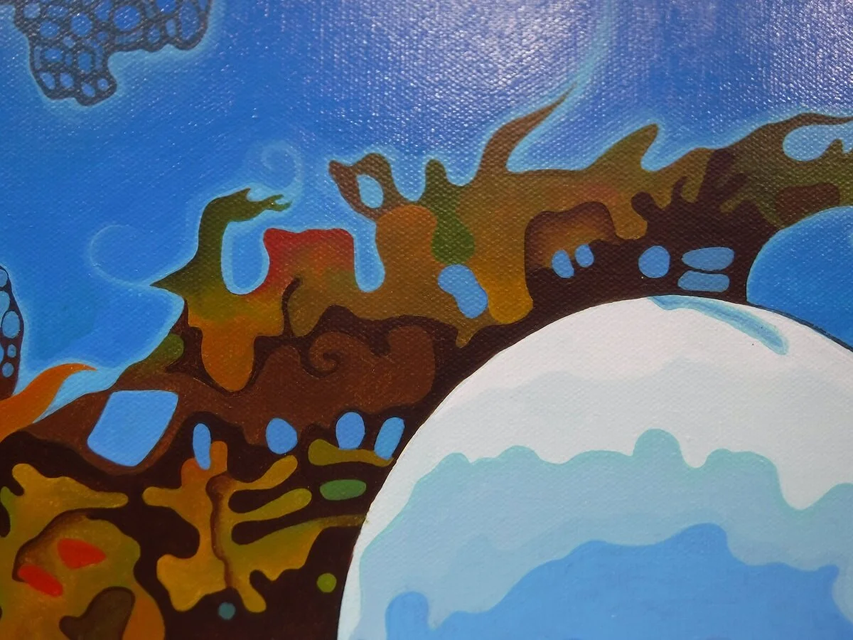
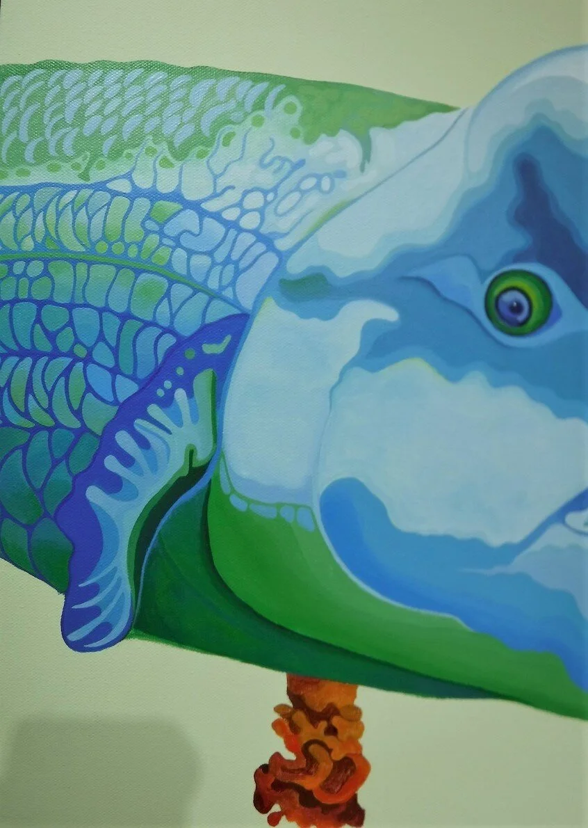
A closer look at the seaweed details.

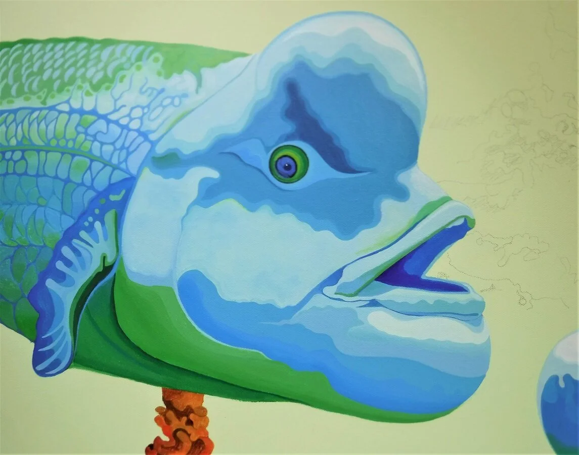
I think it’s pretty much finished. I have to try to take a good picture, then I can varnish it.
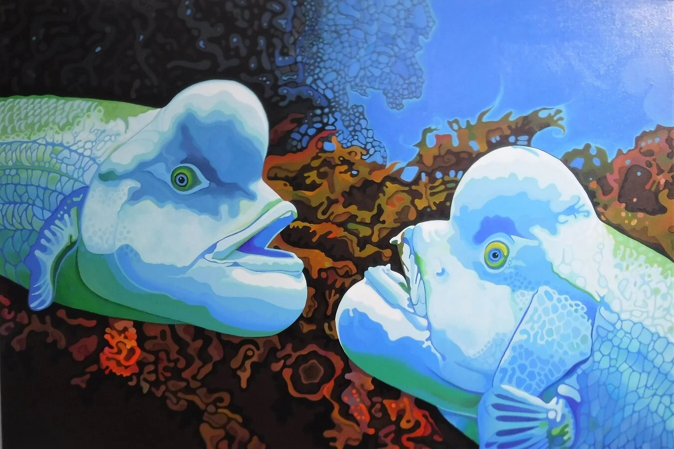
The finished painting, varnished.

I had to re-draw a simpler design for the triple panel front door window. The first one had pieces that were just too small to cut out of glass. I really like it too…but this will look fine. I’m going to try to get clear glass jewels for the panels. That should add a bit of sparkle.

This is the inside of the door, with the three panels of glass.

The second panel is the one I liked. I changed it a bit to make it fit the window size. It’s going to be mostly clear textured glass to let as much light in as possible, with some red, cobalt blue, and amber glass. The colours will go with the two panels I already made for the front foyer, and the stairwell. I found this on Pinterest.

A close-up of one of the small rose panels, foiled.

The first of the small rose panels soldered together. It needs came around the outer edge, and a black patina. The black patina always makes it look 100% better.

The three small rose panels, soldered together. They still need the came around the outside edge, and black patina.

The almost finished large rose window for the inner door. I still have to put the zinc came around the edge, and polish it, and polish it, and polish it…then install it.

A close-up of the window, soldered together, but without the black patina.
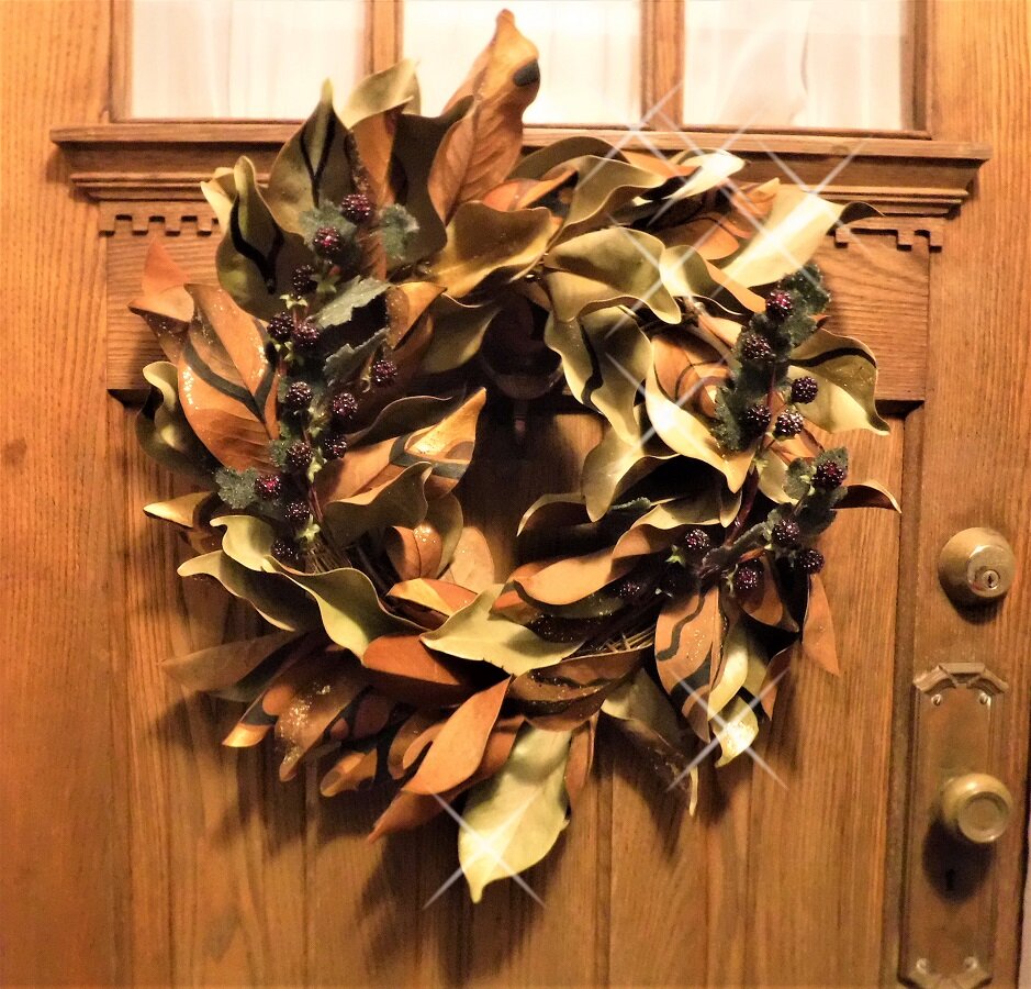
The magnolia wreath for the front door. I added some blackberry decorations to it, and some gold glitter.

The zinc came is on, and painted. I have to flip them over and do the other side now, then I can install them.

The windows with light coming through them, from inside the house.

I finished cutting the wood strips for the outside of the door. I don’t have enough to do the inside of the door right now. I bought all the wood strips Canadian Tire had. I’ll have to wait. It looks good though.

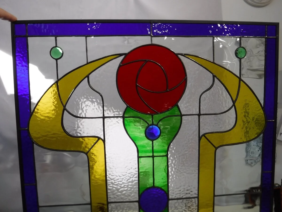
I finally got around to doing the drawing for the stained glass for the inner front door. I have some cobalt blue glass left over from the other two panels, which I want to use for the border. The inner door doesn’t get much natural light, and we don’t need the privacy, so I can use a lighter textured clear glass for the background. I need a good red or pink glass for the rose, and some light gold glass for the ‘wings’. I’m thinking of doing the central part in green. That might change. I’m going to finish the hyacinth painting first though, since this will take over my studio table for the duration of the construction. I’ve been thinking about doing this for a year, at least. After this, there are three small windows in the front outer door that will have to be done too. I’m still thinking about them. This design came from a picture of a firescreen I saw on Pinterest.

This is the original photograph from Pinterest. I liked the overall idea, but I changed some parts of it.

I saw this too, which I liked as well. The central single rose panel might work for the other door.

The inner front door, in the front foyer.

This is the outer front door. I did the pattern, but when I was cutting it out I realized some of the pieces were too small, so I stayed up until 3 a.m. trying to redraw it without any success. I’ll have to rethink it.

This was the drawing I did on the computer. I really like it, but it’s too complicated. I have three 7 inch wide window panes. This would have to be a lot bigger than that for the smallest pieces to be cut from the glass. I really like it too.

I saw this screen on Pinterest, and liked the pattern.

The mess I made trying to re-draw the rose panel. The original is so pretty. Well, I have other patterns I like, I can do one of them.

A close-up of the large rose window for the inner door. It’s soldered but it hasn’t had the patina applied yet.

The finished window, with the black patina. It still needs to be cleaned and polished, and it needs the zinc came applied to the outside of the panel. Then I can install it. It looks nice.
The rose window for the inner door, with the came attached to the outside edges, and painted black. It’s ready to install now.

A close-up photo of the rose window. Cleaned, ready to go.

We managed to get the rose window installed into the inner door. It’s held in with some clear silicone seal, and some glazier’s points. I’m going to add some thin strips of wood to cover the edges, and make it a bit more secure. I like it. Now I can put the zinc came on the three small rose windows for the outer door.

The finished window with the wood strips installed over the zinc came to hide the glazier’s points, and the small gap around the came.

The three rose windows installed on the outside of the house. They have silicone seal holding them in. I had to order 1/4” wood strips from Canadian Tire to trim them, to hide the little gaps. I have to paint it, then I can install that, which should help hold them in place.

The windows from inside the foyer. Ooooh, they look good.

The left hand panel.

My mother, Trudy Small in Gibsons, B.C. with the ‘avalanche’ pour painting.

A drawing of me, by my mother Trudy Small, in 1974. The coat was bright green.

My mother, in front of the Arts Center, in Sechelt, B.C. Burrell Schwartz in the window.

Me, in 1974, in the green jacket.

Another drawing of me, by my mom. Also done in 1974.

A fantastic drawing of a figure, by my mother.

A vintage photograph of my mother, Trudy Small.

A painting of me, my Aunt Heidi, and my mother, all in one. Paint applied over an old painting, then scraped off, then the black lines were painted on top of that.

Leaf collage. Photographs, cut painted paper, staples.

‘Avalanche’ painting, Trudy Small. One of the spray paint and water pour paintings. The blue sky was painted after, to help define some of the shapes.
Trudy Small, vintage photograph.

‘Seated woman’ drawing, Trudy Small.
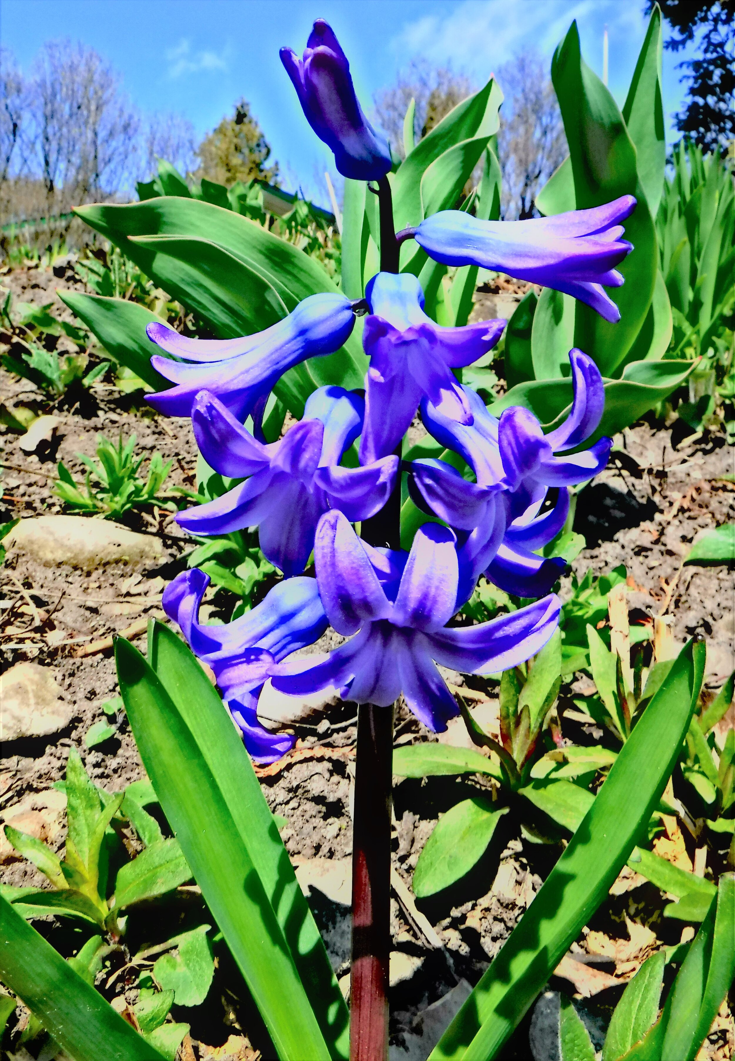
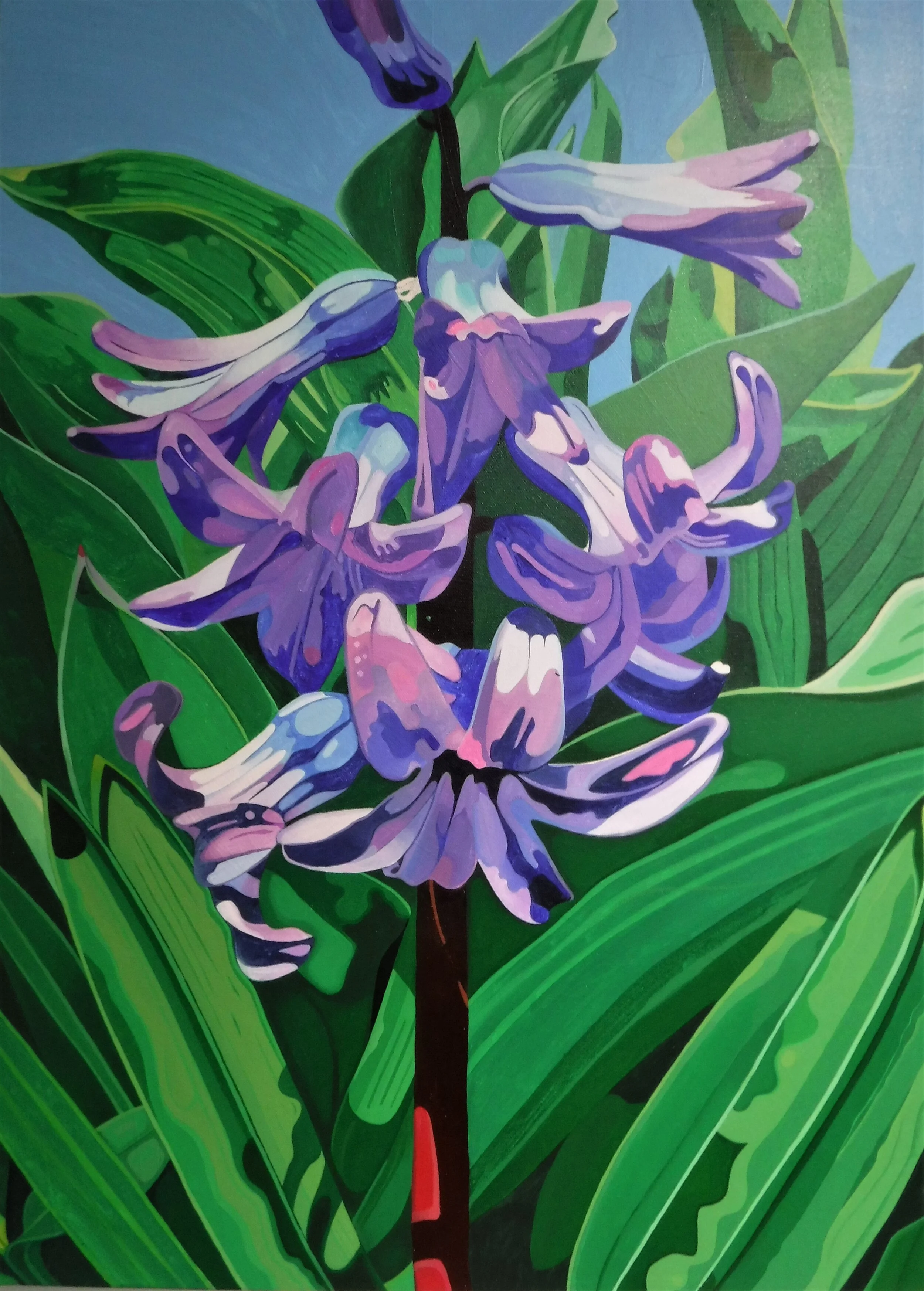
This is the photograph for the next painting. It’s of a hyacinth that was growing in the neighbourhood in the spring. I just loved the colours. I’m combining this photo with another one of leaves that I took in another garden. The drawing is done, I just have to mix the paint and start. I don’t have a verse to go with it yet. I’m sure I can find one, or write one.

I started the painting. I like it so far. I’m combining the original photograph with another one of just leaves.
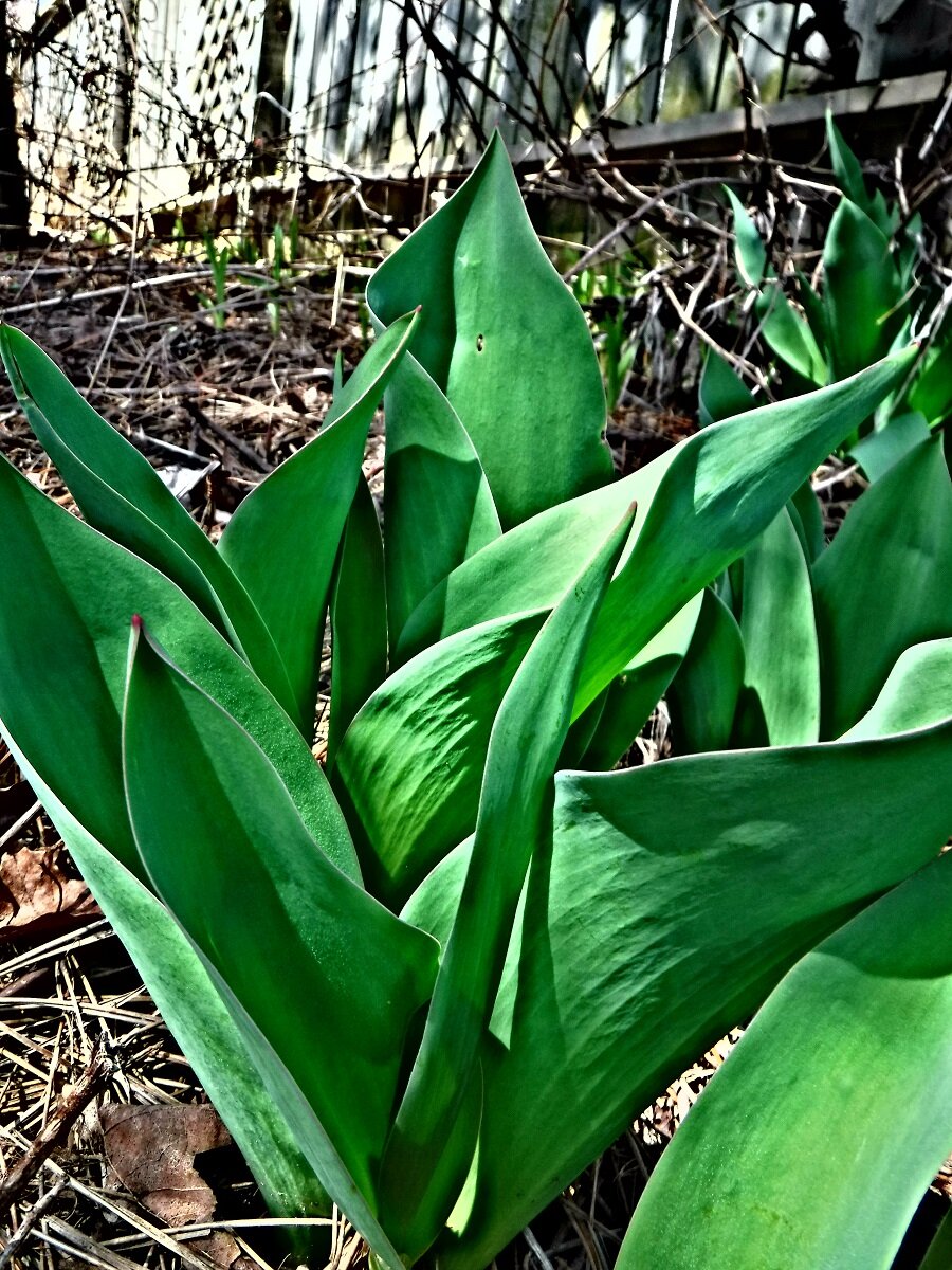
These are tulip leaves in another garden. I wanted to fill in the bare earth background in the original photograph with more leaves.

A closer look at layer one of the painting. I usually do at least 2 or 3 layers to smooth out the brushstrokes. I love purple and blue.

Even closer.

I painted some more of the leaves at the bottom of the canvas. I’m going to do the bottom flowers next so I can see what it looks like.

One more flower done, and more leaves, and the sky. I’m basically painting the easiest things to reach first.

Finally finished the first layer, on to the second layer. It already looks better. The second layer of paint always looks richer and smoother than the first. There will be a layer three though.
I did another layer or two on the two leaves on the left, and the right hand side. Not happy with them yet. Close, but no burning tube of leaves, as they say.

I’m still painting the leaves in the background. I’ll do the sky next, then the flowers. It’s taking a while, but it’s working out o.k.
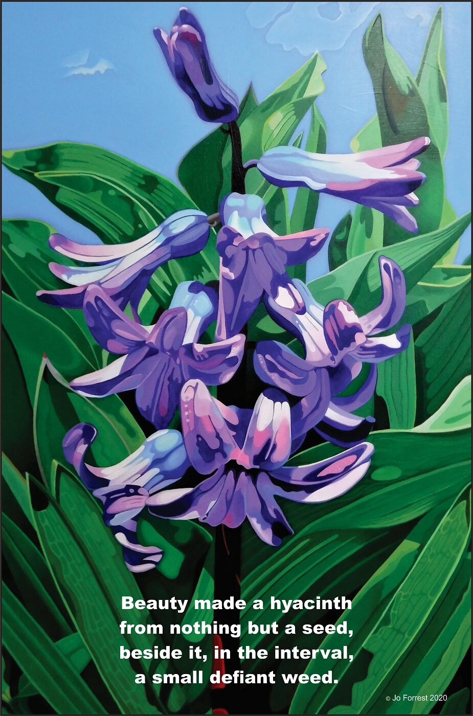
I made a T-shirt out of this painting, with the text from the poem ‘the gilded crown of lilies’ #764 v:13

I made a t-shirt from the painting, and a mug.

The mug with the ‘hyacinth’ painting on it.

The bomb went ‘boom’,
I broke a tooth,
there’s not much else to say,
the tower gave its atoms to the wind,
and blew away.
I’ve seen the heart of suns #759 v:6 2020
I started the next atomic blast cloud painting. I’m hoping it won’t take a wrong turn along the way.

I stayed up late and did the bottom part of the painting. So far, so good. This is looking the way I wanted it to look. The red/pink/orange background is going to be painted over with black paint so only thin lines of the colour will show.

This is a close-up of the bottom part of the painting. This might actually work.

The first layers of grey are on, with more to come. I started doing the black background to see if I liked the coloured lines or not. I think I do. If not, I’ll paint them out.

A closer look at the black background. I think I like it. I’m not sure yet.

Painted a layer of black over the background, leaving the coloured lines. I painted some blue circles and overpainted them to add a bit more colour. I’m making the dark areas darker, and the light areas lighter in places to add more contrast. I do like it.

I did another 3 hours on the cloud. I think the top part still needs work. It seems a bit vague to me. I’m going to think about the background next. I might paint out some of the shapes.

O.k., so, I added some flames. It’s basically finished now. I have to add another layer of black paint to the background to cover some of the small brushstrokes that show the colour underneath. Otherwise, it’s signed and tagged, so it must be finished.
I started the next painting, called ‘boom’. It’s from a black and white photograph of an atomic explosion I saw on-line. I just liked the shapes.
Boom and crash shiver the house,
shaking the walls and canting the paintings
just a little off-kilter.
I swim up the chimney and take a breath,
wrapped in the persistent dreams
of tattered flags from unknown countries,
long forgotten in the inundation.
the patchwork animal #758 v:14 September 2020

Two layers so far. I like the shape on the far right.

The original photograph. I was going to do it in black and white and grey, just like the photo, then I thought, what if I added just a little bit of colour…and then this happened.

The day before. Some of the basic shapes done with a larger brush than usual.

I was up until 3 working on the painting. I like some parts more than others, so I’ll keep painting until I like all of them.

And now for something completely different. I decided to go back to my original idea of a black and white image, with some colour. I thought it was getting out of hand with all the colour. I like this better, so far. It looks more like a cloud now. Not sure about the second area of pink and white. I’ll finish painting it and see if I like it. If not, it’s only paint, I can paint over it. This is why things take so long sometimes. I try something, and it doesn’t work out. For some reason, it’s the simpler shapes that give me a hard time. I did a painting of a peach that caused me the same problems, but then, the next painting of four peaches went smoothly. I don’t know why. This could end up being the same thing. I hope not. I really like parts of it. There’s a weird thing in the bottom left hand side I like. It was an experiment with some crackle paint, and it worked, so I kept it. I’m thinking it’s the exhaust from a rocket, to go with the boom cloud.

A closer view of the right hand side. It looks more like a cloud now. I like the shape beneath it too. I’m going to try not to get carried away with the colour this time…

Layer 7 of 20… Now I have to paint lighter grey and white areas onto the dark grey. I hope I like this. I like the black and white area to the right a lot more now. I doesn’t look so much like a fried egg anymore.

What a difference a day makes…painted some parts out, and I like it better. Still a long way from right, but I like more of it now.

Waaaaaiiiiitttt a minute….do I actually like this now? Really? How many layers did it take?

A closer look at the bottom of the painting. I’m repainting the orange/pink shape in shades of grey, (only 49), and I’m changing the circle things to red. Man, I tell you. 20 more hours ought to do it.

I stayed up later than I wanted to, but I was trying to do all the grey in the background. Now I can paint over the pink/orange bit in the middle. I really love the pink and white striped cloud thing at the top. I’m going to try to keep it. I still have a long way to go. I wrote a poem called ‘I’ve seen the heart of suns’, the word ‘boom’ appears twice, so I’m going to use one of them for this painting. I haven’t decided which one yet. Or maybe I will use another verse from another poem. It appears several times in previous works.

And…. fade to black. Add some flames. Recalculate. Hmmmmm…. I think I like it.

More work on the background and the flames. The top needs more work, it’s too dark. I ended up painting out the stripey cloud shape, even though I really liked it. I need to make a stencil of the word ‘boom’ with my Cricut. It doesn’t need to be too big. I’ll probably do it in a dark grey on the black background. There isn’t room to do the whole verse. There is another image I like so I might do another one.

I added more dots to the painting, and two swirls. It still doesn’t feel right. It needs to have a bit more light grey in the body of the cloud. The tones are too muted. I added a little gold to the flames, which doesn’t show in the photograph. I haven’t done the text yet.

O.k. so, what happened was… I still didn’t like it, so I painted the white ‘cells’ on top of the previous layer, then painted the insides of them grey, now I’m repainting patterns into them. This could take a while. I’m also fading the white to grey and dark grey at the edges, which works. I’ve stopped painting for a little while, so I can make a curtain for my kitchen. It takes over my whole studio table, so I can’t do both at the same time. Oh, for a barn/studio with lots of tables…
Up late, as usual. The top part still needs more work, but it’s getting there, wherever ‘there’ is… It kind of looks like a night sky on the left hand side, where it’s dark.
I’ve got some resin I want to try out. I went to Michael’s yesterday and got some glitter, and this cool skull mold. I can’t wait to try it out.

This is the mold I got of some cool skulls. It’s a proper silicone mold for resin, so I’m hoping it will work fine. I have to think about what I want to put in them. I might do some plain, and maybe paint the back, I don’t know yet. I have a plastic heart mold from Valentine’s day I want to try too.

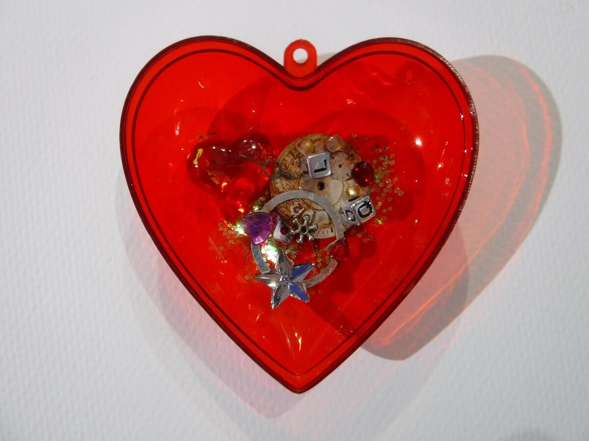
This is half the heart. All the inclusions will be face down, but I turned them over so I could take the photograph.

I got a rainbow of glitter too.

I got these to make a couple of necklaces.

I got these two small bottles with corks in them, and miniature playing cards. They can be a necklace too, or I can attach one to my charm bracelet.

Two of the necklaces, poured. The skeletons were from Halloween cards I got last year, and the hearts are either from Michael’s or the dollar store.

The third necklace, and a corned beef tin lid, with a plastic transparent skull sticker, dice, a watch spring, a heart jewel, and a piece of shell with some seaweed attached, and some glitter. I painted the tin white first.

I poured too much into the mold, of course, and made a mess, but that’s me.

The vapor mask.

Two hearts, from a candy container from Valentine’s day. I sprayed them with Pam, so I hope they release. I won’t know until Wednesday afternoon. I hope they will have set by then.

I also poured a small bottle charm, and a small box with some sand and a shell in it from New Zealand. The shell floats to the surface, so next time I’ll pour a small layer and let it set, then pour another layer so the shell is in the middle. I’m not taking it out of the box.
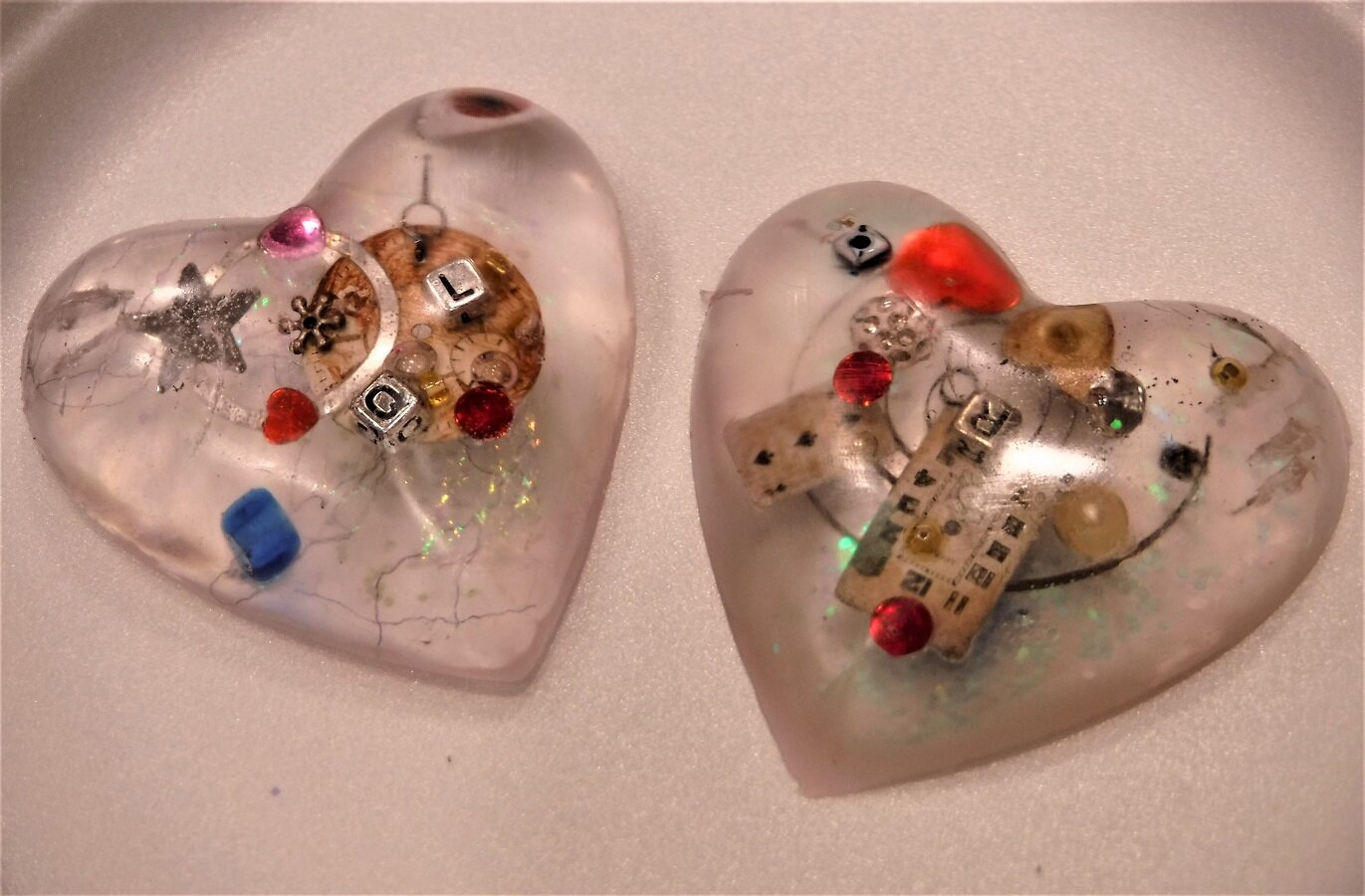
I had to use a hook to pull them out, but they did finally let go of the mold. I’ll use more release agent next time. I really like them. I want to do an egg shape. I might have a mold in my studio somewhere. These have watch parts, and beads as inclusions. I’d also like a resin that cures faster than three days. It’s been hard waiting so long to find out if they worked or not.
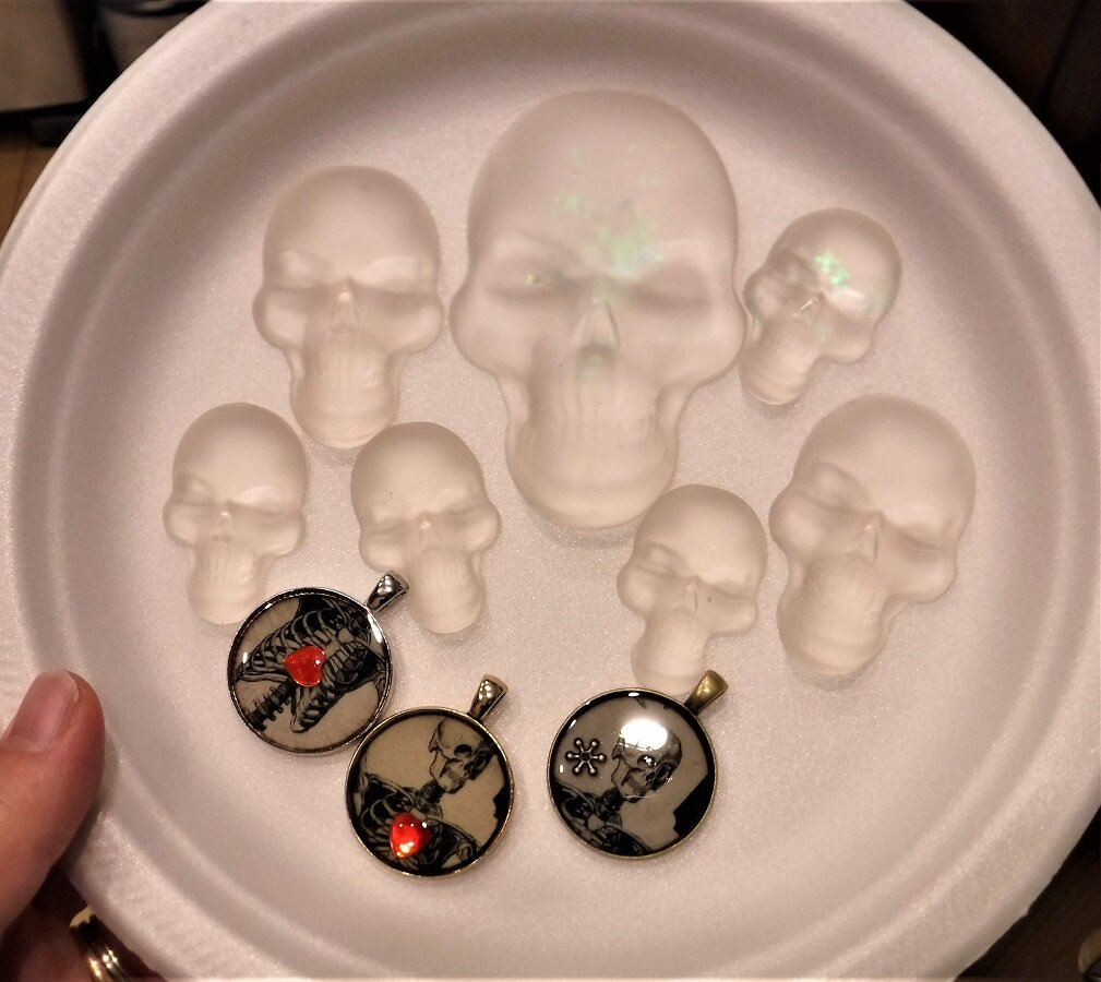
On the other hand, the little skulls and the necklaces turned out pretty good. I like them. I’ve been thinking about Halloween lately. I don’t know how that’s going to work with the pandemic. Things could be worse by then. There’s lots of candy in the stores. If I buy some, I’ll eat it, so I’m not going to.

This is the corned beef lid assemblage, with a layer of resin on top of it. the heart jewel floated up off the surface, but I like it better like this. It has a clear plastic skull sticker from Michael’s, some red dice, a watch spring, and some glitter and a piece of shell with some seaweed attached to it. I have to put a wire hanger on the back somehow. I have lots of tins I could use. I like it.
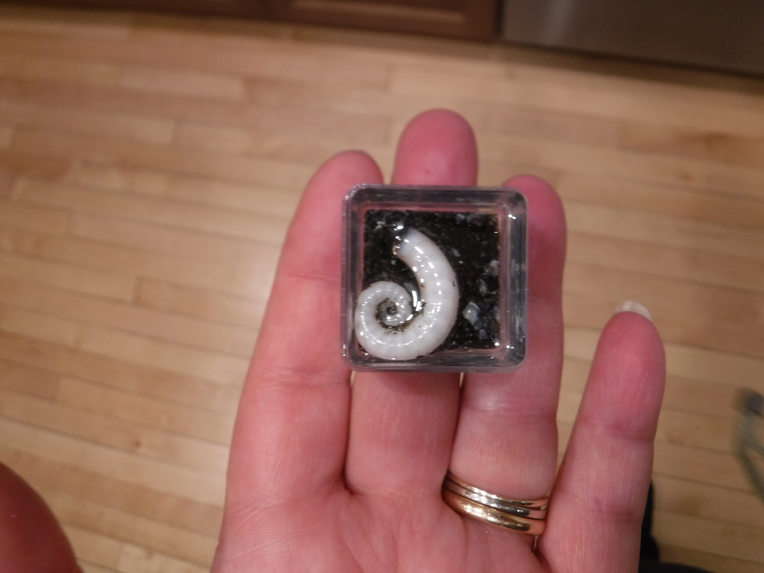
This is a small spiral shell I got from a beach in New Zealand when we were there in 2011. I’m leaving it in the plastic box. I’m not sure it would come out even if I tried to get it out. The shell floated up to the surface of the box, so I might pour a little bit more on top of it, so it’s submerged.
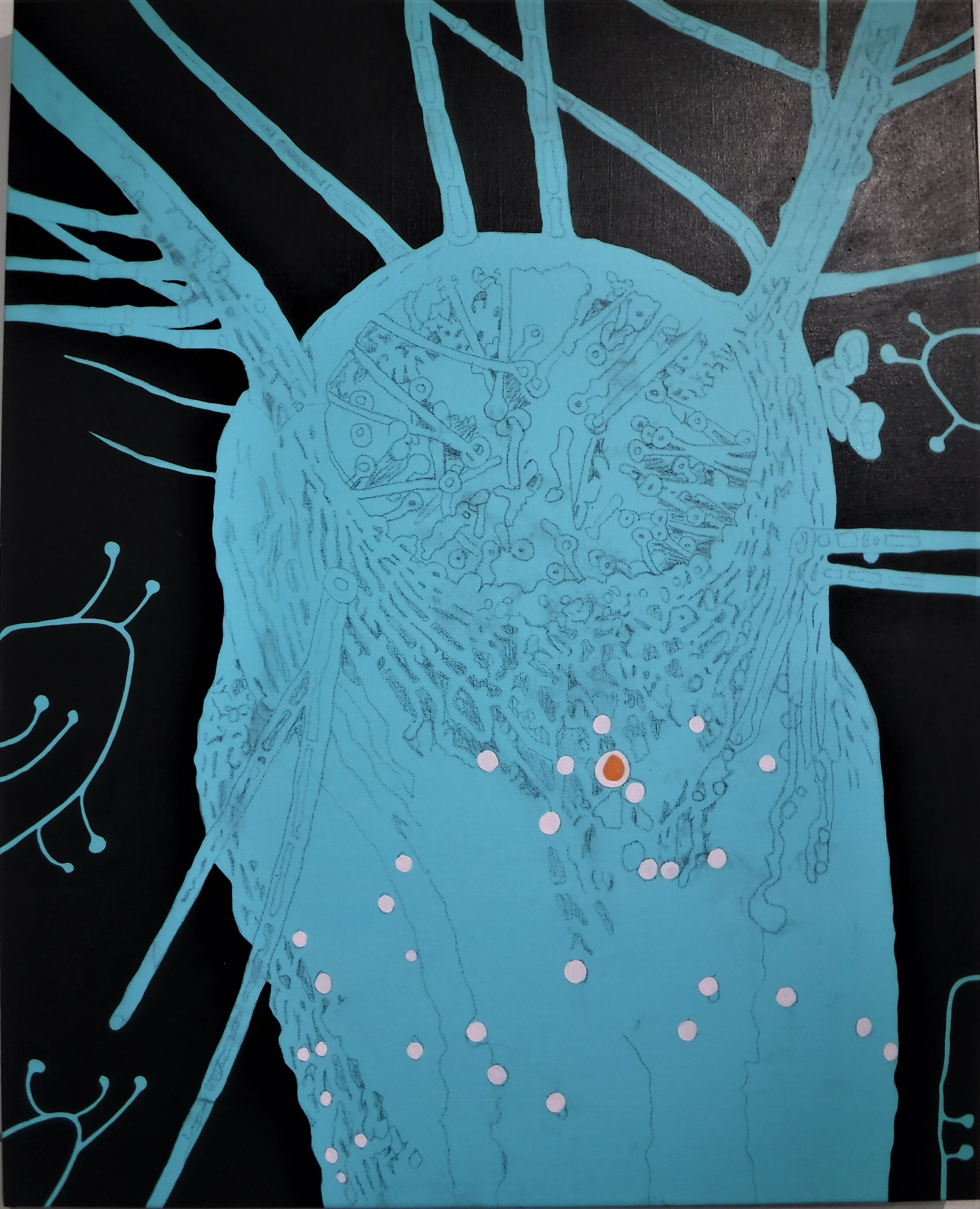
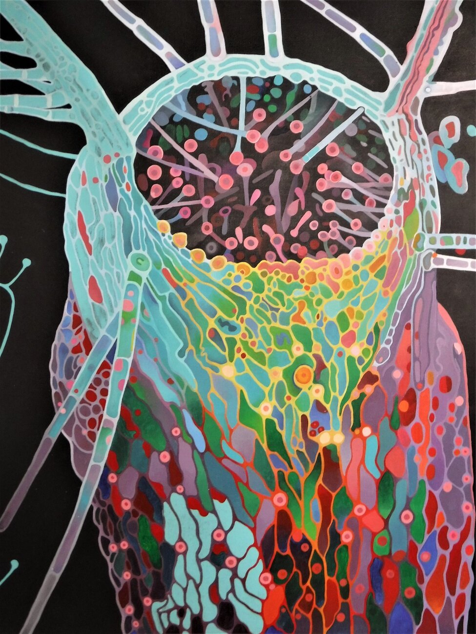
Started a new painting last night. It’s from a macro-photograph I saw on-line of a bladderwort called a ‘utricularia’. I really like the alien form and the colours.

Started doing the colour on the right hand side. The inspiration photo is beside it. It’s taken me 7 hours to get this far, so now I’m thinking it’s going to take longer than I originally thought.
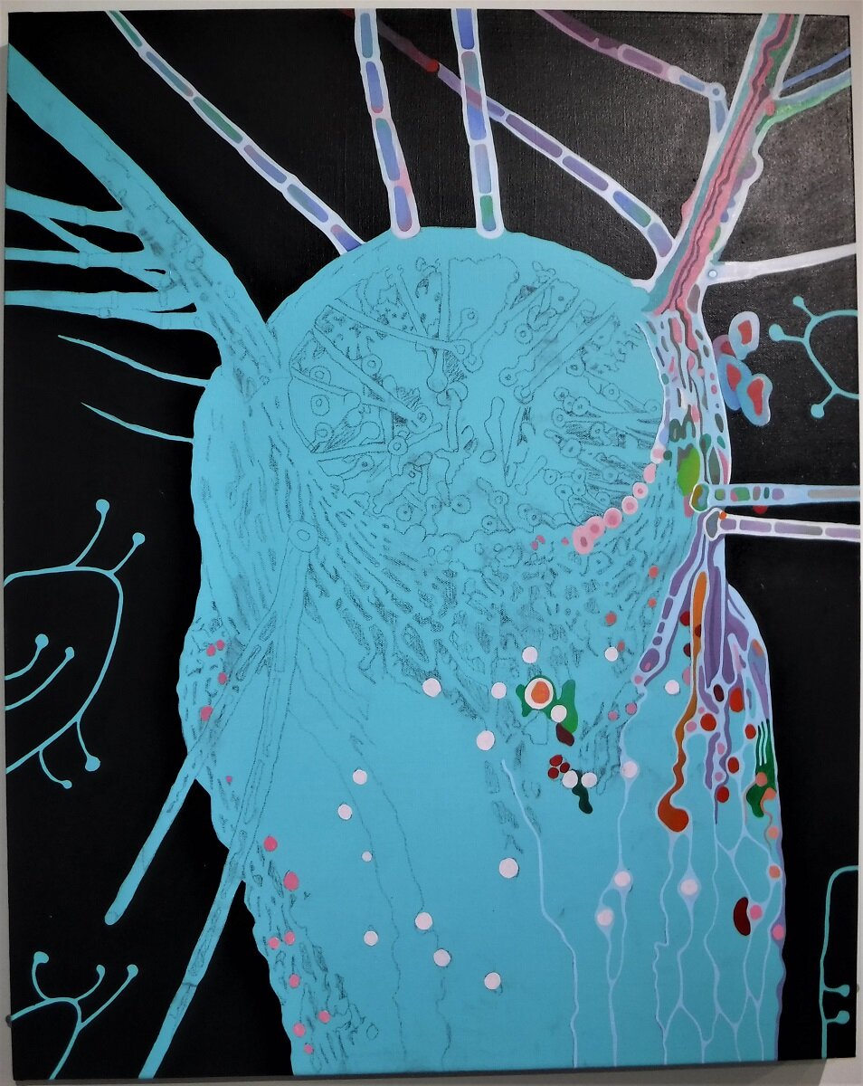
A better view of the painting.
A close-up of the work so far. It needs at least one more layer of colour, maybe two.

I stayed up late doing the white lines, for the texture of the skin. They’re basically there as an under-drawing. The colour will change later.

A close-up of the white lines. Now I just have to fill them in.

I was up until midnight working on the painting. Just 5 more minutes… I like to finish a section if I can.
I had to get up early this morning, so midnight was late for me. I had to have a nap yesterday… All the white lines have to change colour too, so I’ll start that next.

I started overpainting the white lines with colour.

My magnifying light. I can see better with this.

I stayed up late last night and did some more work on the painting. I spent a couple of hours this afternoon painting as well, instead of sliding off for a nap. It’s so addictive I don’t want to stop.
I was up ‘til 2 working on the bottom section. I really wanted to stay up and finish it, but I still had to do the dishes, so I stopped. It really bothers me if I can’t finish something.

Layer one, done. Now I can go around it again, adding more shading, and changing things I don’t like. I got two more canvases from Michael’s so I can start priming them for the next paintings. I submitted my work to the Bau-xi Gallery for consideration. I’m not really expecting them to respond, but it was fun to do. I would really rather sell prints of my work, than the originals, but then, I’d like to know how much my work is actually worth, and if anyone else likes it. They have a gallery in Vancouver my mother and I used to go to in 1973 and 1974, when I had braces and had to have them adjusted once a month. There’s one here in Toronto too, so I could be coast to half-way to the other coast.
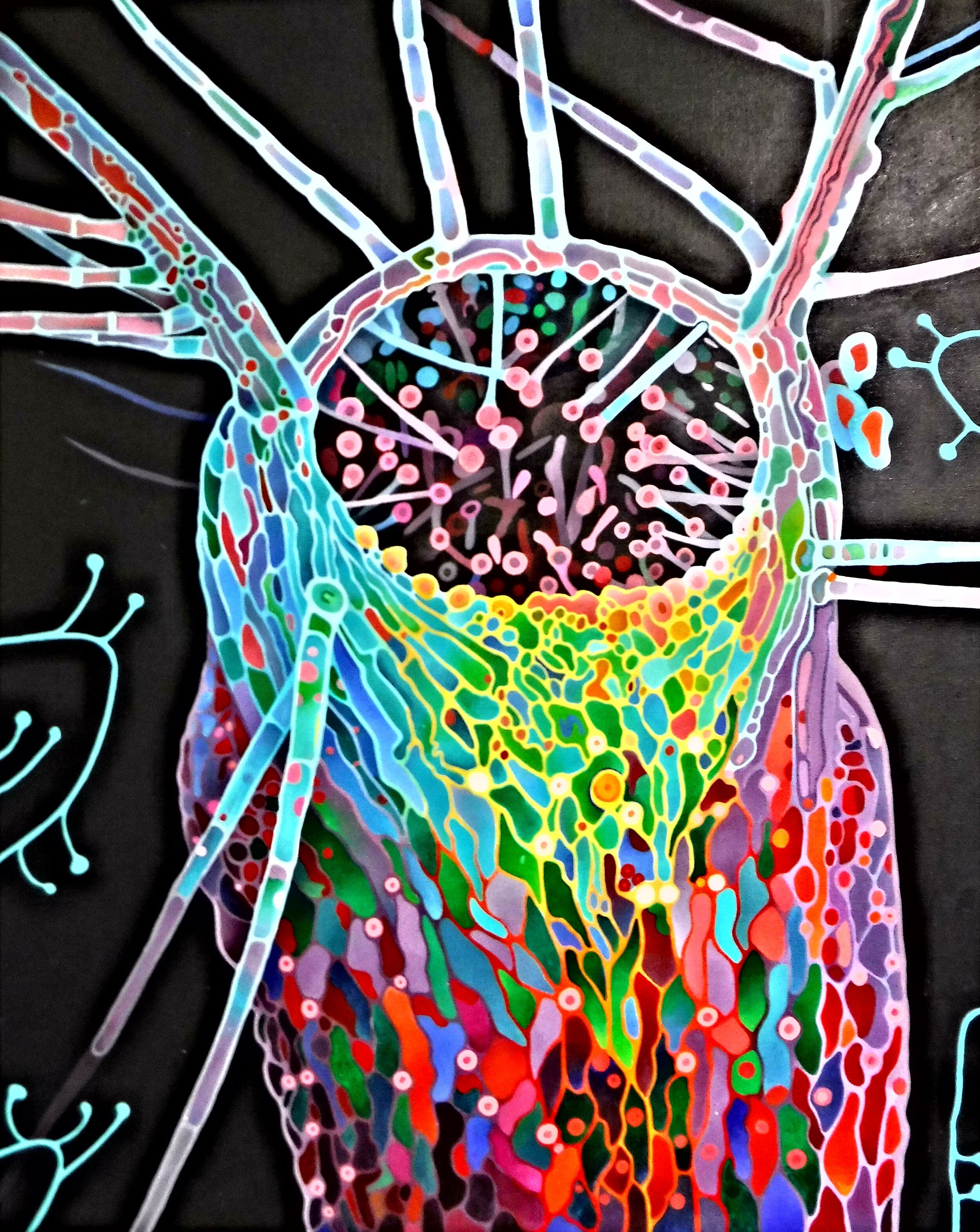
Starting layer two. This is the best photograph I’ve taken so far. There’s a high-contrast setting on my camera. It bumps the colour up a bit. The lighting in my studio isn’t good enough to take good pictures with. There always seems to be a shadow or a glare somewhere.
The response I want to have is: that kicks ass. Need I say more?

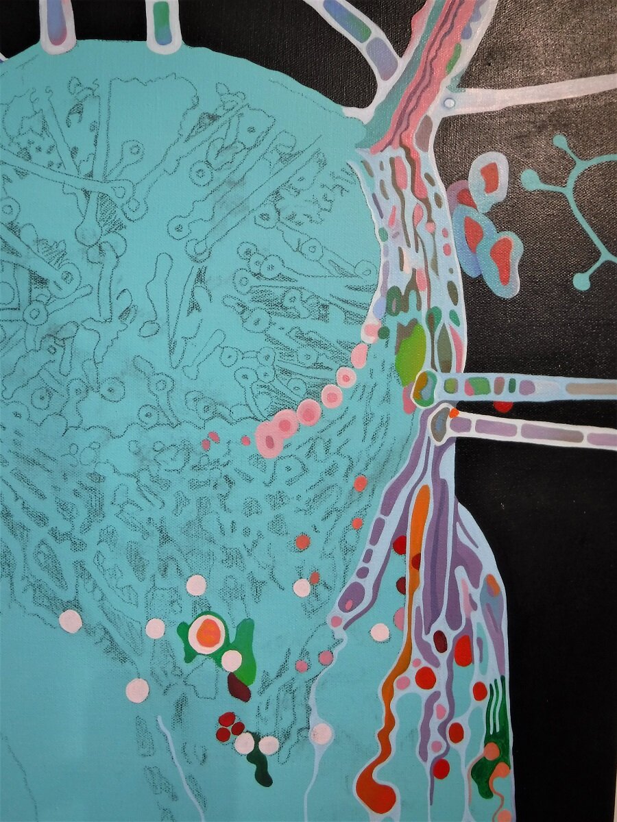
A closer look. I really like the dark green to light green shapes in the center, where they meet the dark red/blue shapes.
I did 5 more hours work on the painting yesterday. It’s getting there. I like it. It’s very colourful.

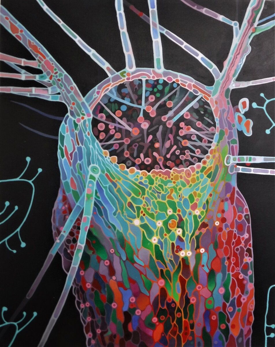
I did some more work on the painting. I didn’t like the right hand side where the pattern transitions from purple to orange, so I repainted it. There’s still one area that’s a bit too muzzy. I’ve started gessoing the next canvas. I don’t know what I’m going to do yet, I have lots of options, but I pinned a couple of photographs of atomic bombs exploding that I really like. They’re x-rays, so they’re black and white. I might think about doing them in colour instead. I haven’t made up my mind yet. They’d also look really good as large pencil drawings. I used to draw a lot when I was young. I didn’t even start painting until I was in my late 20’s. I still feel like I’m learning, and improving. I guess if that ends, it’s time to stop.

This is one of the images from the internet of an atomic blast. I really love the shapes.

This is another one. I like the little spikes on the bottom, and the shading.

I’ve signed the back, so it must be finished. I’ll wait for a couple of days, then varnish it. It makes the colours look richer, but it’s hard to photograph without getting glare from the light. I need to take it outside to get better light for the photo.

This is the back of the painting, signed, with its tag. The smirch at the bottom right is my thumbprint, just for fun. I keep thinking, in a hundred years, no one will know who did this.
I sign the side of my work, if the canvas is deep enough. I don’t want the signature to detract from the image, which I think it would do if it was on the front. You can see some of my other paintings leaning up against the walls beside it in my studio.

I’m growing stones to feed the world,
there’s water for the soup,
and there you were, a burning tiger,
jumping through a hoop.
from the poem ‘stone soup’, #737 v:6

I entered two poems, and ‘Lily, lily, rose’ was accepted.

‘rapunzel’, painting of me at the house in Oshawa. This painting went with the poem ‘the house of luminosity’, which wasn’t accepted. I tried to send it, but it might not have gone through.

The lily painting for the poem ‘lily, lily, rose’.

On-line now.
They sent another email asking for any information on recent projects, so I sent them images of the two books, ‘dancing down entropy street’, and ‘echoes in the void’.


I have three paintings included in Art Nova’s Halloween on-line exhibit. It goes on-line on October 30th or the 31st. More details to follow.

The ‘dancing skeleton’ painting on the Art Nova Halloween online exhibit. October 31 2020. From the painting for the poem ‘anchor’, also the cover of the book ‘dancing down entropy street’, through Amazon.

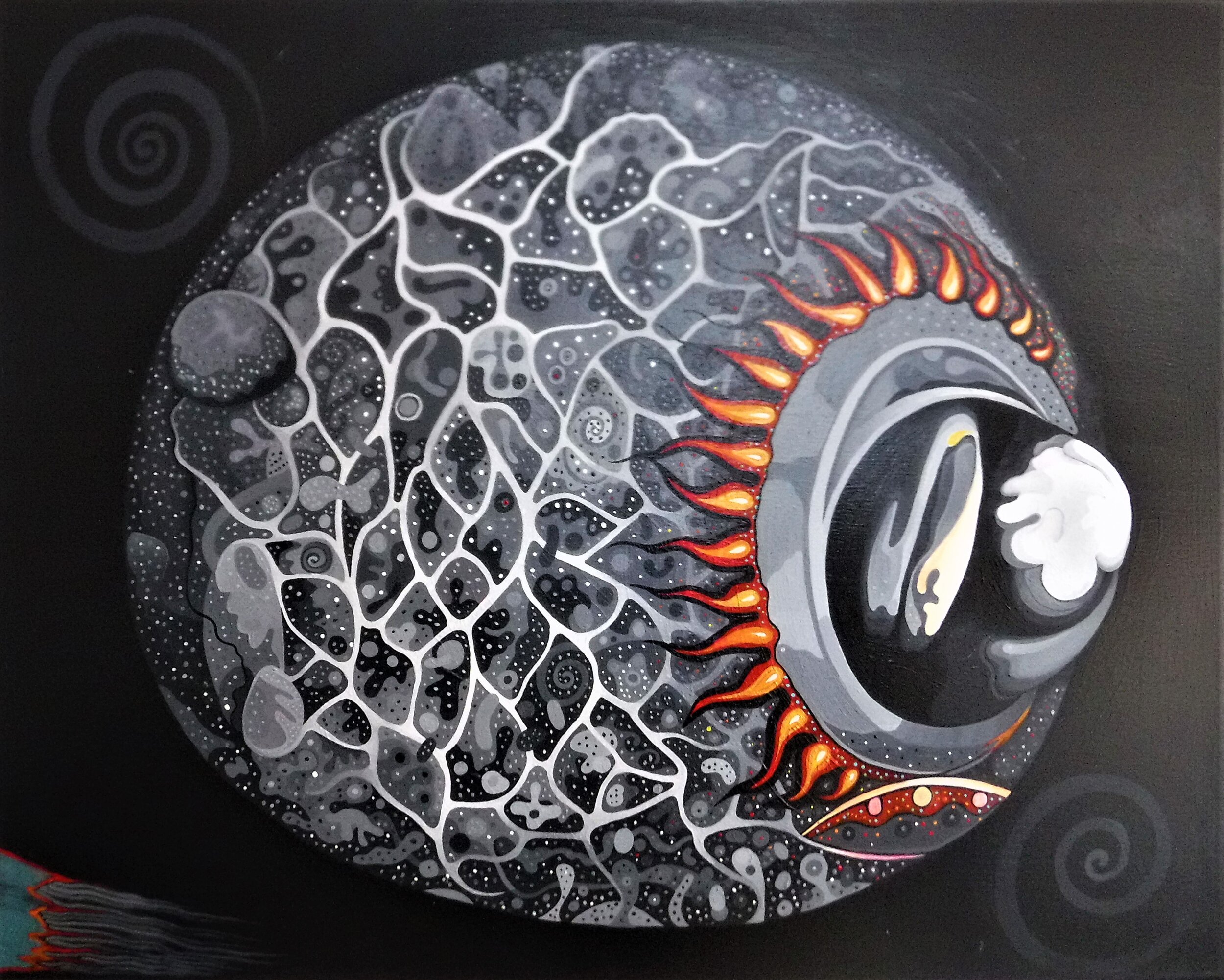
Crystal skull painting for the poem ‘the blood angel’, from the book ‘echoes in the void’, through Amazon. Art Nova Halloween exhibit Oct 31 2020. ArtNova.com

A detail of the collage for the poem ‘zenzizenzizenzic’, from the book ‘echoes in the void’. Art Nova online Halloween exhibit, October 31 2020.

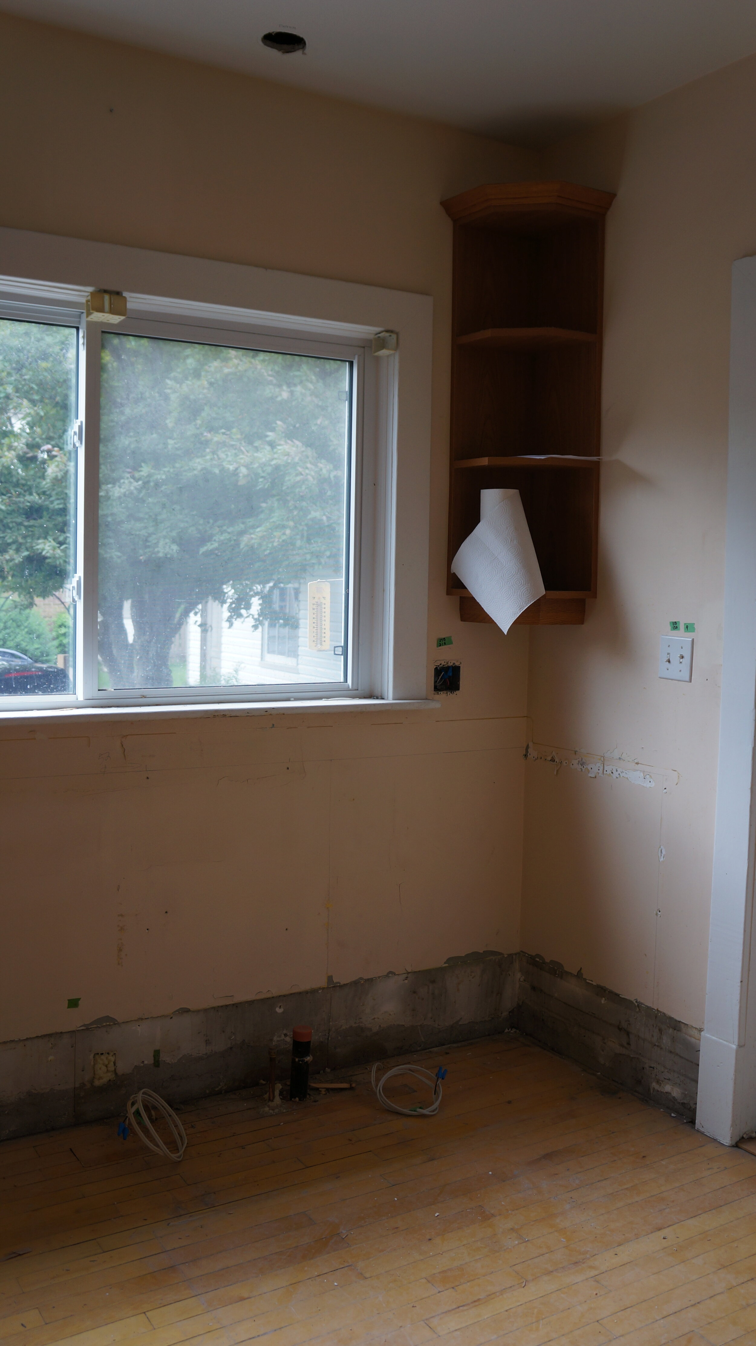
The before picture. Fridge and cupboards, with the pantry in the corner.

All the kitchen cupboards are gone. This is where the stairs used to go up to the landing to the second floor. They have to stay, but they’ll be hidden inside the new cupboards.

The before picture of the cupboards, sink and dishwasher. One of the main reasons we wanted to do this renovation was because of the ‘bump out’ on the countertop. It cuts into the floor space, and makes a small kitchen ( 9 x 11’ ) feel even smaller. The cupboards were nice enough, but the new layout will make a real improvement on the function of the space.
This is where the old sink and dishwasher used to be.

The old cupboards, and the stove and microwave.

This is where the old cupboard and stove were.

Cupboards and fridge.

This is where the old cupboards and the fridge were. There also used to be an old built-in pantry, where the stairs are.

Drywall over the empty space where the pantry used to be.

The floors in the kitchen and hallway sanded.

The hallway.

First two coats of sealer on the floors in the hallway and kitchen.

Top coat, still wet.

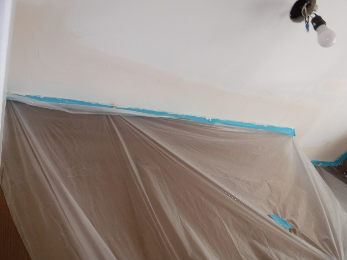
Drywall mudded. Drying with the aid of a fan.

The new cupboards in the front room.

The new cupboards going in.

The corner, where the pantry used to be.

The corner where the old pantry used to be.

The new pantry, and cupboards where the fridge is going to go.

Where the old pantry used to be. Look at all that storage space.

This is where the new sink, and dishwasher will go.

The cupboards where the stove and microwave will go.

The temporary kitchen set up on the dining room table. Chicken curry and rice.
The countertops are going in today. Pictures to follow.

The corner, where the pantry used to be, and the new sink and a half. They still have to grout the joint between the countertop and the backsplash under the window. It needs a custom colour to match the countertops.

The Lucent Calacatta #LQ5131 countertops and backsplash. It’s so pretty.

The old pantry corner, and the new sink.

The crown molding on the cupboards where the fridge is going to go, and where the old pantry used to be. The ceiling needs to be plastered to lower it to the top of the molding still.

The crown molding over the cupboards where the stove is going to go.

The crown molding over the cupboards where the old pantry used to be. This is the biggest gap between the top of the molding and the ceiling. The joint under the window has to be filled with a coloured grout still.

The little corner cupboard with the crown molding. It’s so cute.

Took some pictures with the better camera. It does a better image than my small camera.


Waiting for the appliances to come.

The last seam grouted between the countertop and the backsplash above the sink.
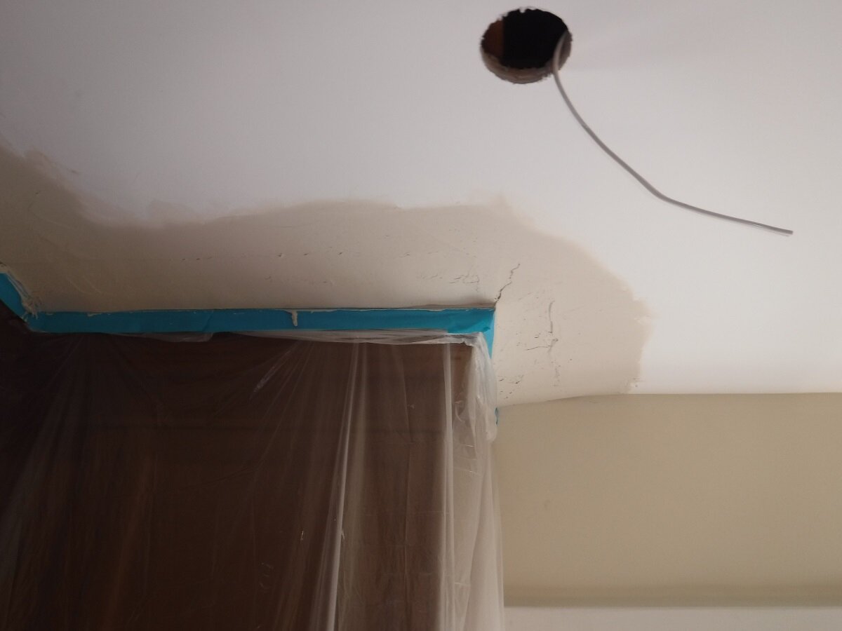
The mud on the ceiling. Two layers. Now it has to dry, and then they’ll come back and sand it.
The mud over the fridge wall.

The new stove, which fits perfectly. It still has the protective blue film on it.

And the new fridge, which also fits. We were worried it would look too big for the space, but it’s fine.

But the dishwasher, doesn’t quite fit.

Another picture of the stove. I’ll wait to take the film off after all the work has been done.

Got the dishwasher to fit. Baseboards are going in today.

Running hot and cold water.

The dishwasher is in, but not plugged in yet.

The microwave is in.

I took the plastic off the fridge. It looks like a real kitchen now.

Summoning mirror with burning candles.

A photograph of my hat on the bench in the front hall. I like the two textures together.

From the poem ‘the house of luminosity’. #729 v:5 Hand-written text on lined paper.
You sneezed a grim ejecta from your heavy lungs
and coughed,
you smeared your face with soot and ash,
your banner, held aloft.


‘rapunzel’ painting for the poem, ‘the house of luminosity’.
The killing starts at six o’clock,
I hope you brought a gun,
you’re smug enough to shrug in your
democracy for one.
v:37
My glasses fog with every breath,
I see how lost you are,
we waited while the lumpy muppet
smoked a cheap cigar.
v: 24

I’m making a curtain for the grillzebo. I’m painting a fern on the top, and a New Zealand pattern on the bottom. The canvas only has one layer of gesso, so the surface is rougher than I usually paint on.

More leaves painted, and some of the background. Ooooh, it’s lookin’ good….

Did some more work on the curtain. It’s slow, but it’s getting there.

Finally made it to the bottom of the curtain. It needs another layer of paint, but it’s essential finished.

The almost finished curtain, hanging in the studio.

Finally finished the curtain, and it’s only August. I’ll let it dry for a couple of days, then varnish it.

Sprayed the curtain with some spray varnish, and hung it up. There’s a pocket in the bottom for a steel rod. That should stiffen it a bit. It was a long project, but I like it. I’ll have to see if it works next. It’s supposed to block the setting sun from shining on the ceramic barbecue.

You’re the one who started this by leaving,
roaring drunk,
you, and your corona, and your
funky spunky junk.
from the poem ‘corona’, #712 v:9
included in the next book, ‘echoes in the void’.

I took the sad machine to bits,
and sold it for its parts,
it’s bad enough we’re sober
in this time of broken hearts.
from ‘the cadence of our years’, #719 v:7 From ‘echoes in the void’.

I cure my dull afflictions with
a little sip of bleach,
it numbs my dumb befuddled tongue,
and liberates my speech.
the dragon-slayer #724 v:14 for the book ‘echoes in the void’.

You sneezed a grim ejecta from
your heavy lungs, and coughed,
you smeared your face with soot and ash,
your banner, held aloft.
‘the house of luminosity’ #729 v:5 from the book ‘echoes in the void’.
Viruses replicate ten times a minute,
two become four, become eight,
I sickened on Sunday, and died on the Monday,
it must have been something I ate.
from the poem ‘into the limitless void’, #735 v:18 June 2020@

Bones shake a fever to fight the infection,
I shook for a day and a half,
what started as some kind of visceral howl,
unbridled a baffling laugh.
from the poem ‘into the limitless void’, #735 v:19 June 2020@

mirror/mirror
Blowing through the barren trees,
a dire wind of sighs,
a rage of bones,
a rage of bones,
a rage of bones to rise.
jo forrest 2020@ from the poem mirror/mirror
#738 v:43